Level design in its most boiled down form, is the process of making a playable environment from concept art and ideas. The role of a level designer is often just whiteboxing a level to so it can be test played before it moves on to be "set dressed". Level editors or game engines are the tools of the level designer.
The Whiteboxing process level designers use is a quick time efficient way of getting ideas out. The use of untextured simple geometric shapes is most common but some companies like valve for example would use a different texture for floors or walkable terrain and separate texture for walls or other immovable untraversable objects. Much like concept art, level whiteboxing is often used as a stepping stone to push idea generation and to test if ideas would actually work in a game.

A simple whitebox made in UDK that could be used for play testing.
During, before and sometimes even after the whiteboxing process the designers should be thinking about the various gameplay elements that would be added. Things like spawn points, cover, ammo or health pickups (although thanks to magical health regenerating systems this happens a lot less in modern games). with the whitebox and play testing the designers are able to test to see if these components work well together.
One of my favourite maps of all time would have to be 2fort on Team Fortress 2 by Valve. I believe this is one of the best maps in the world as it melds verticality, different access points and fairness all under a big cloak of aesthetic loveliness.
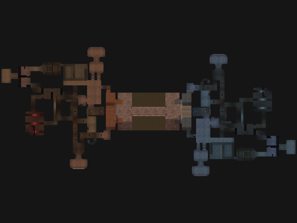
From the start you can see how each side is colour coded based on what team you happen to be on. Although you might think this is dull and stupid, its actually extremely important as the game can get rather hectic at times and needing to quickly establish which side to run to to get your health pickup can be the difference between virtual life or death. Luckily the nice guys at Valve made the colours opposites, blue and orange, so they stand out and its easy to recognise the different bases from each other giving the player visual cues to help them out.
You can see by the cross section, that the map is actually mirrored. this is an easy way a level designer can make sure there is absolutely no unfairness to a multiplayer map as both teams will have the same sniper spots etc.
Another element i love about this map is the verticality. It forces the player to be more aware of his/her surroundings as you could be jumped by a soldier rocket jumping up from below or even a sniper shooting you from up high, making the game more tense/fun without having to add any new gameplay mechanics, a simple and effective technique in making any multiplayer level more fun.

No comments:
Post a Comment